
sift café
PROJECT — 2024
SIFT CAFÉ MOBILE APP
enhancing the dining experience with connection and convenience

People who find themselves entering order after order for their peers need a way to quickly obtain and submit these orders so that they can prioritize their time in their busy schedules.
“How might we design an app that makes it easier for café goers to ask for and receive multiple orders from their friends without sacrificing time?”
ROLE: UX Designer
SCOPE: 12 weeks
PROCESS: Research, interviews, surveys, competitive analysis, ideation, prototyping, testing, and evaluation
TOOLS: Figma, Procreate






PROBLEM
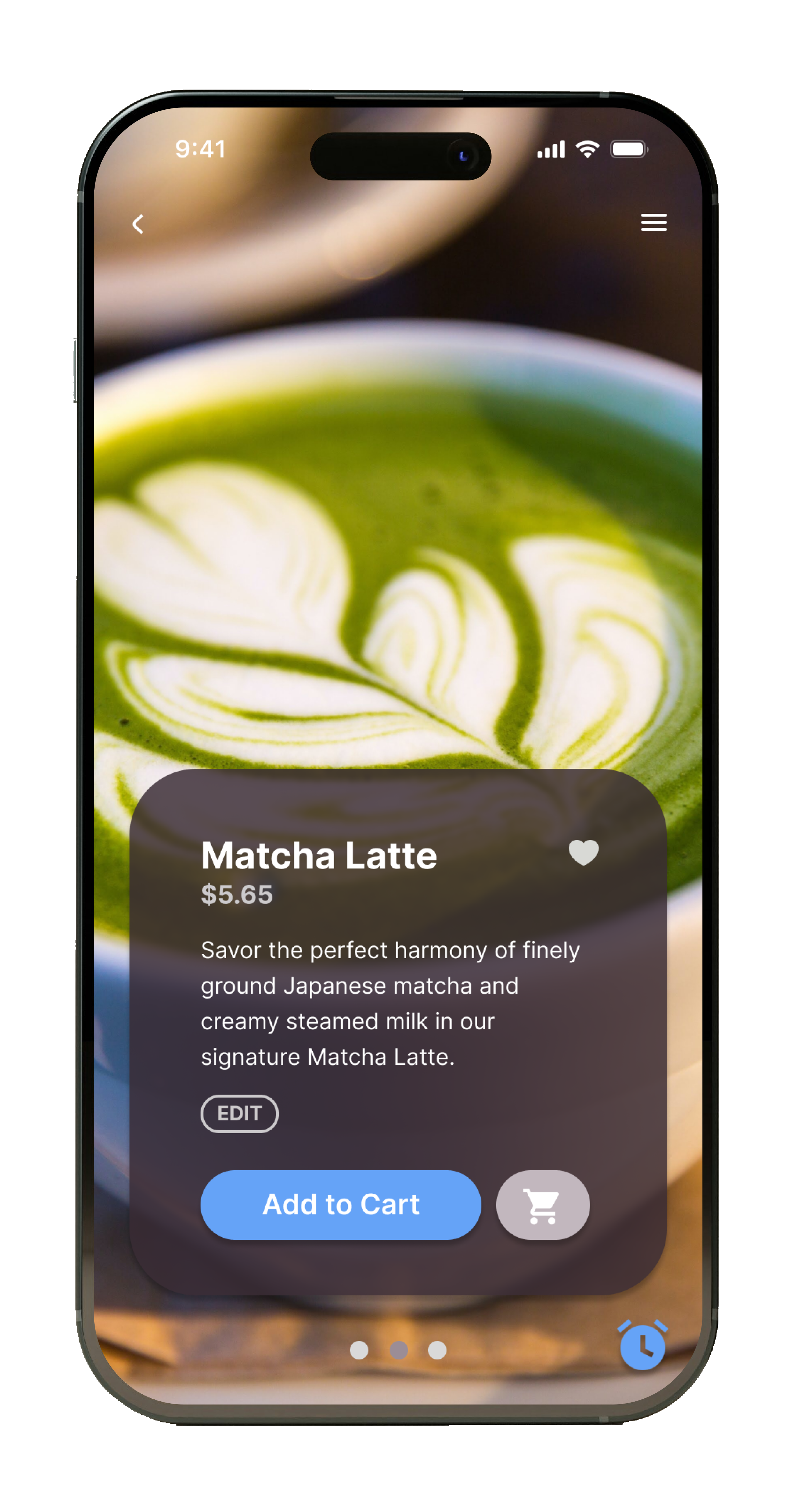
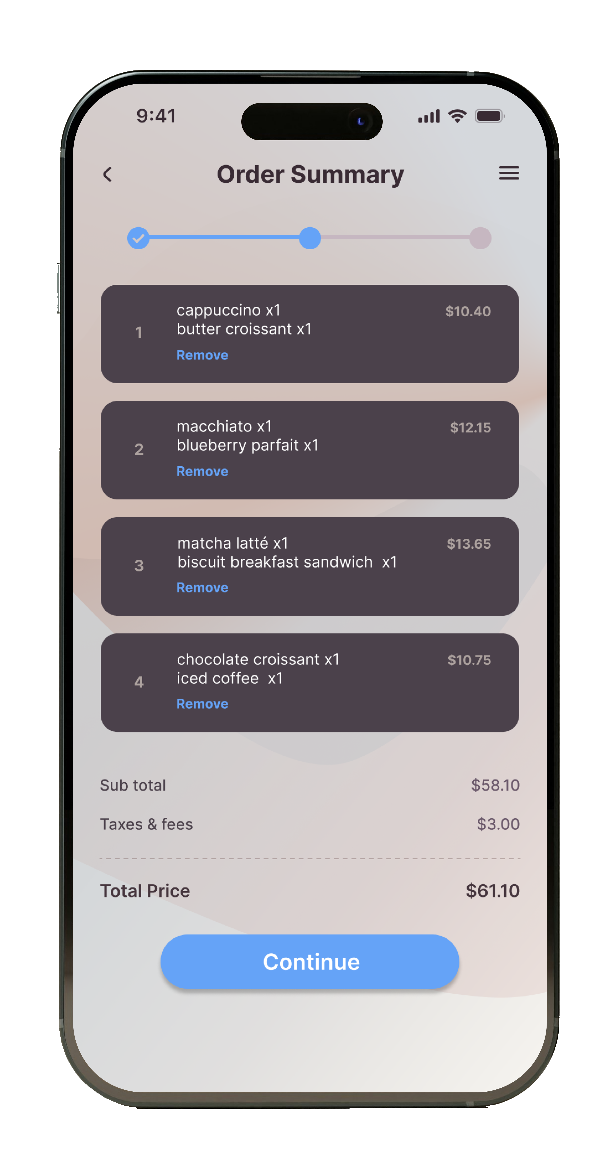
There is a market gap for a mobile application that provides café goers with a seamless solution for on-the-go ordering as well as an efficient platform for placing bulk orders.
In the world of the food service industry, we have seen technology continually revolutionizing the way we dine and order. The convenience of placing your orders online or on apps have completely enhanced the ordering process, making it a go-to way for customers to engage with restaurants. However, while online and in-app ordering is efficient and time-saving for individuals, coordinating a bulk order for multiple people still comes with many challenges.
Coordinating a group order can be time-consuming and complicated. It requires collecting everyone's preferences, dietary restrictions, and payment information, and then placing the order with the restaurant, within a short period of time, often cutting into what could be a relaxed outing, or morning coffee with your coworkers. There is a clear lack of an app that bridges the gap between social sharing and efficient ordering.
By creating an app that allows users to easily place and coordinate group orders with their friends or coworkers, we can successfully fill this market gap and streamline the process of ordering food for groups.
RESEARCH
Competitive & SWOT Analysis
I started my research process with a competitive analysis to gauge this café’s major competitors and to provide strategic insights on their features and functions. The key competitors that I identified are Beatrix, a neighborhood coffeehouse, restaurant, and meeting place; La Fournette, a traditional French bakery with fresh-baked breads and sweet treats; and Bittersweet, a European-style bakery with specialty desserts and custom cakes. La Fournette and Bittersweet are direct competitors of Sift Café.

BEATRIX
Beatrix positions itself as a neighborhood coffeehouse, restaurant, and meeting place, with a cocktail program and wine collection built upon both domestic obscurities as well as international selections. Beatrix has an elegantly designed website featuring Beatrix Coffee Club, a membership that allows customers to get complimentary coffee/tea for every seven coffee/tea purchases. While the website is simple and elegantly designed, there does seem to be a lot of overwhelming information, making it somewhat difficult to navigate.


LA FOURNETTE
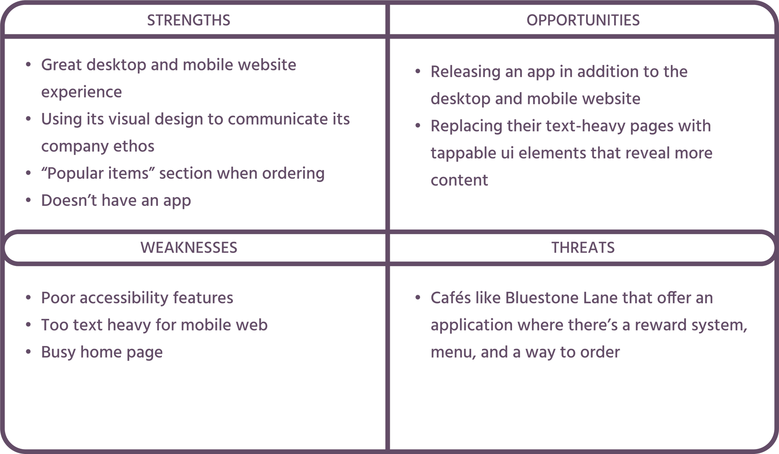
La Fournette positions itself as an “Authentically French, Authentically Chicagoan” establishment with a light and airy setting. It’s a traditional French bakery with fresh-baked breads and sweet treats. La Fournette takes a modern, minimalist approach to their website with an online ordering feature and a “popular items” section when ordering. The website is relatively easy to navigate, with key information easy to find, but some features are confusing, with some elements seeming clickable but are not.

BITTERSWEET
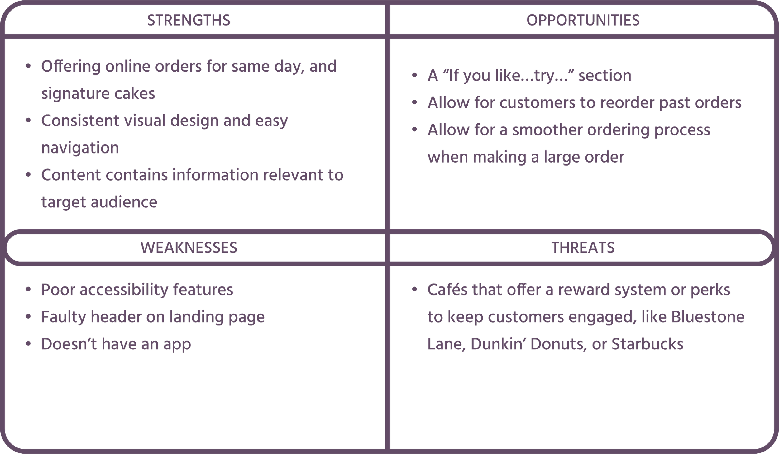
Bittersweet Pastry Shop & Café positions themselves as a neighborhood European-style bakery with a bright and lively setting. Bittersweet’s website design also seems to be modern, with minimalist design and they feature on their landing page a way for customers to order for same day pickup, and for people to find their signature cake. Information is kept up to date on the website and is easy to find.
MEET THE USERS
Personas, Task Flows, and Journeys
As I continued on with this project, I realized that while these research processes are very valuable and play a role in what the final product could become, they center on the company rather than the user. I believe that in order to create a product that truly resonates with and helps users, I have to step into their shoes and focus on their wants and needs. In addition to the competitive and SWOT analysis I conducted, I created two unique user personas, mapped out their journeys, and identified user flows.
USER PERSONAS
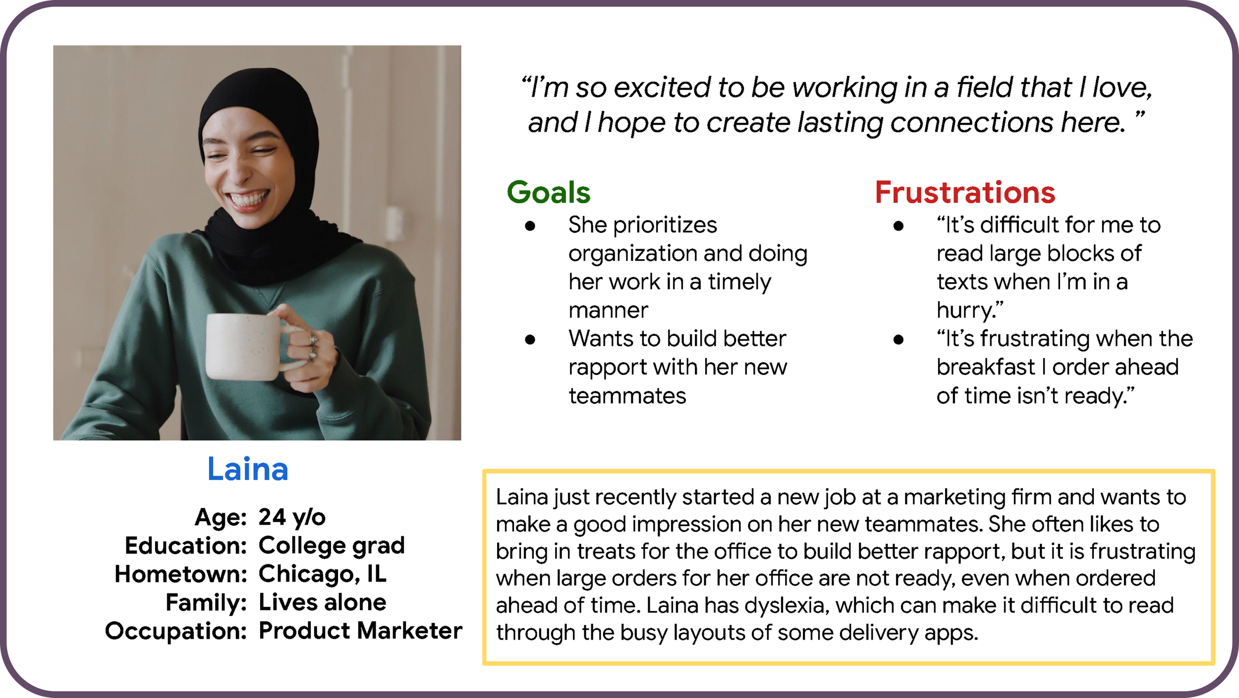
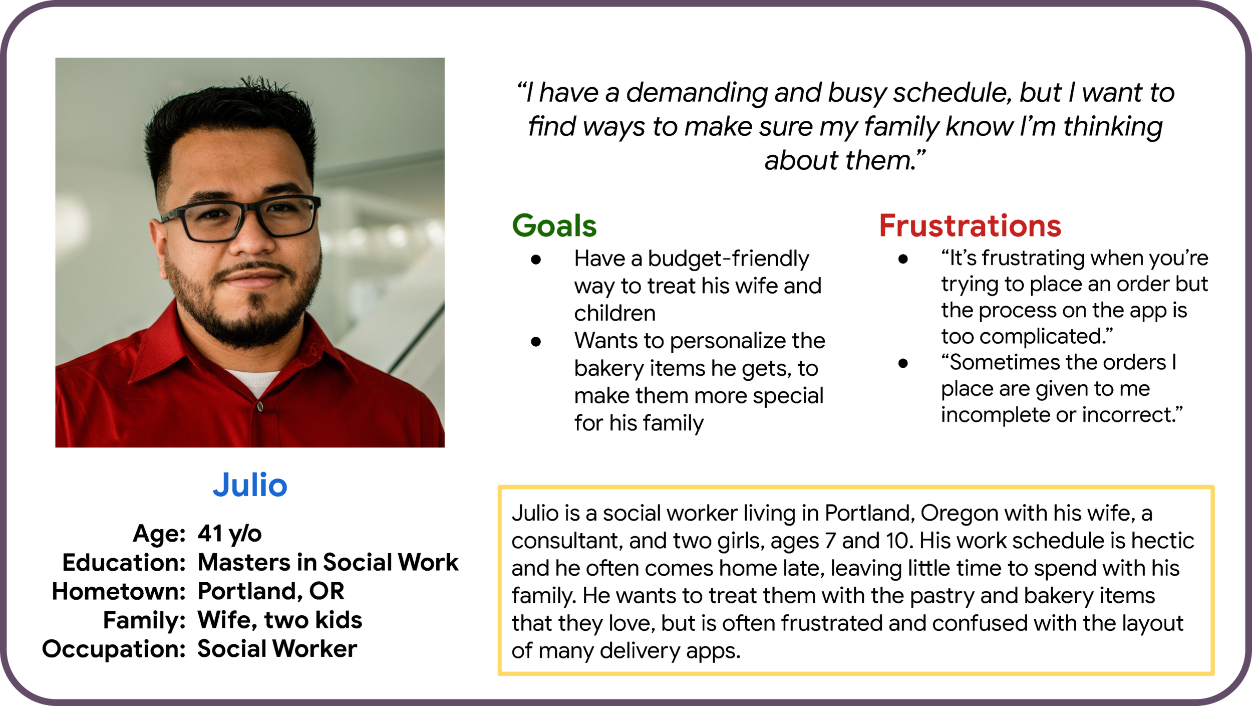
Using my research, I wanted to make sure I could create a set of personas that would vividly represent all users. I wanted to focus on two user groups: junior employees who are overwhelmed with tasks at their new jobs, and parents with a demanding schedule who want to treat their families after a long day at work.
Twenty-four-year-old Laina has dyslexia and has trouble reading through busy layouts and large amounts of text. Forty-one-year-old Julio is not very tech-savvy and finds it difficult to go through the customization and checkout processes.


USER STORIES AND JOURNEYS
From here, I wanted to expand my understanding of these user groups by empathizing with them and crafting user stories that could also help me prioritize design goals:
“As a junior employee, I want to receive drinks on time so that I can make a good impression on my teammates.”
“As a social worker living with his wife and two kids, I want to personalize the bakery items I get so that I can bring home treats for my family.”
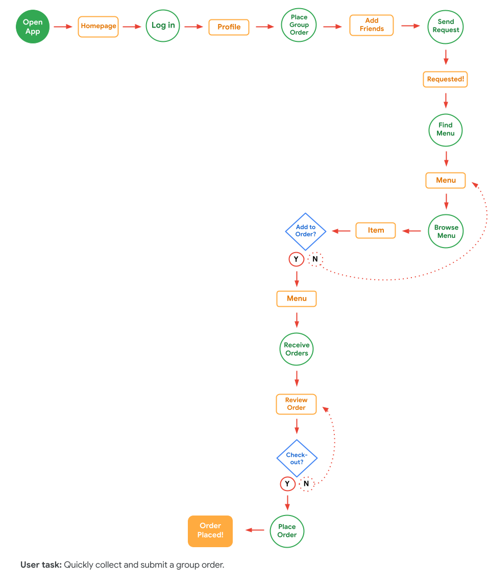
Finally, to build off of the personas and stories I created, I identified the tasks that each user would have to complete to achieve their goals.




IDEATION
Lo-fidelity & Mid-fidelity Wireframes
Before I went into Figma, I wanted to put my pen on paper and draw out my ideas. This process of creating paper wireframes before designing anything on my screen helps me quickly put down the main features I wanted to include in the product based on my research and user studies. This was a fun and easy way for me to find issues early on in the design process and lay out the main user flow without being able to undo or erase my mistakes.
LOW-FIDELITY WIREFRAMES
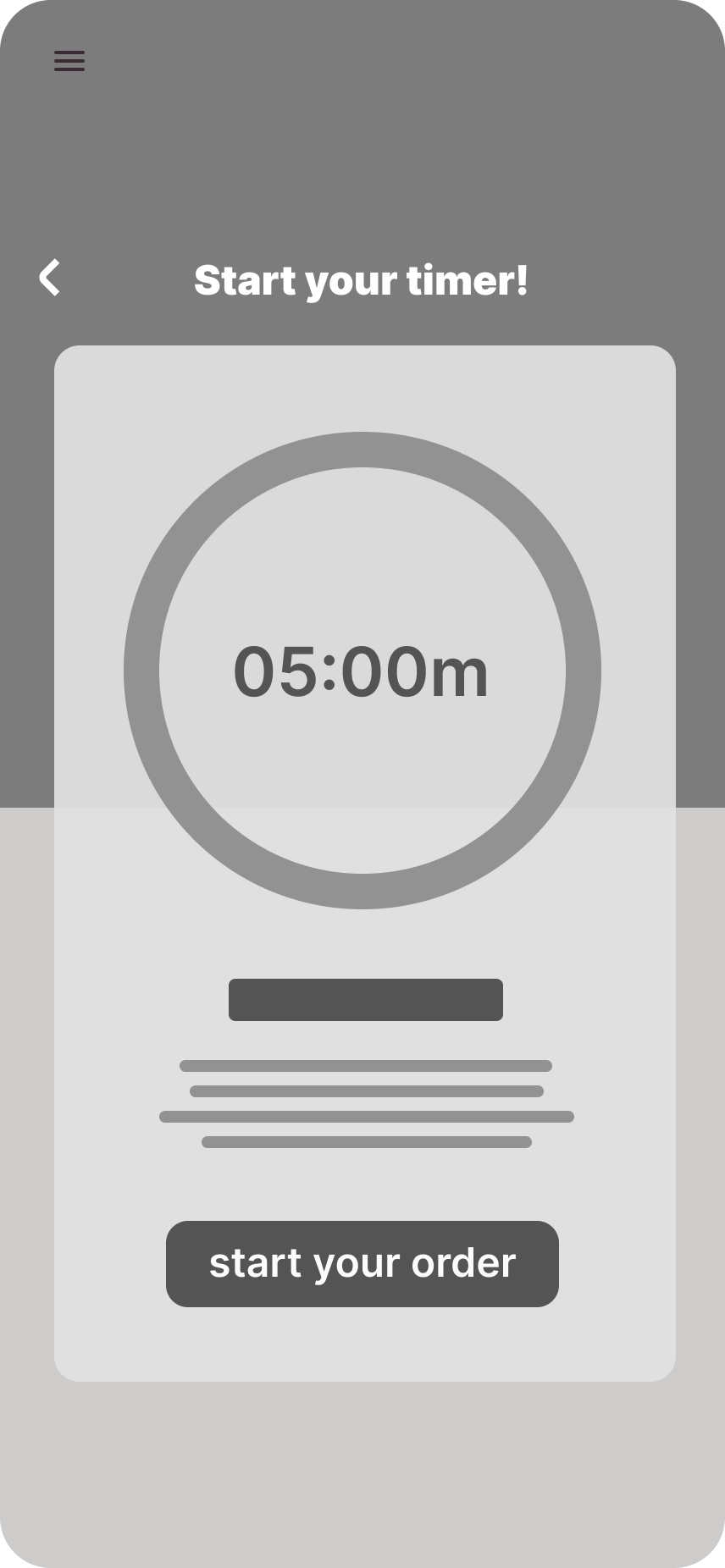
The main feature that I knew I needed to include was a way to make a group order, and I explored what this could look like in the app. For the main user to be able to share this menu with their friends, there would be an option to share a link. Then, I empathized with the main user, who would have to wait on their coworkers or friends to send their orders, so I included a screen where the main user can set a timer for the group members to submit their orders. Instead of the main user having to check their timer in a separate window, I included a pop-out button that notifies the user of how much time is left while they go through the app themselves. As the wireframes evolved, I wanted to make sure they remained user-centric.
While paper wireframes are great and help move ideas forward quickly, I knew that I needed digital wireframes that would be easier to sift through in usability tests. When moving on to the low-fidelity wireframes, I had key features that were ready to be explored further.
MID-FIDELITY WIREFRAMES
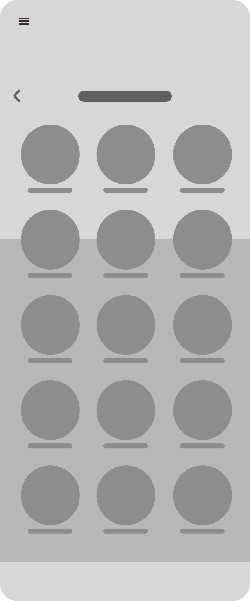
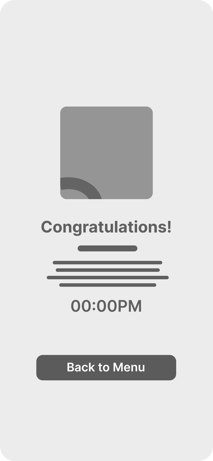
Creating these wireframes was a quick process since I had my paper wireframes as a reference, and it allowed me to see what this app would look like in a digital space. At this point, I realized that there needed to be a way for the user to share the link, so I created a separate screen with a QR code if the sharing was being done in person, and a button to send the link.
I created these low-mid-fidelity wireframes in order to clarify and define Sift Café’s features and ensure my design stayed user-centric as it evolved. From here, I took my low-fidelity wireframes and created mid-fidelity versions that would be easier for people to understand and swipe through in usability tests. Below are some examples of cleaner, more polished wireframes.




RESEARCH STUDY
I created an interactive mockup using Figma and mocked a research study with this research goal: Find out if collecting and submitting group orders through one person/collaborative orders saves the group time when placing orders.
Project background: We are expanding the app to help users quickly collect and submit group orders through one user. Before launching, we need to find out if collecting and submitting group orders is easy for users to do. We’d like to understand what specific challenges our users might face in the sharing, submitting, and payment processes.


USER INTERFACE DESIGN
In choosing the name "Sift Café," I found resonance in the act of sifting itself. Sifting embodies a process of refinement and careful selection, one that mirrors my approach to crafting the essence of this app.
Sifting is a methodical act, requiring patience and attention to detail. In much the same way that I envisioned the concept of the cafe, I tried to make this app shine by using a warm and subdued color palette, high-quality imagery, and the inclusion of negative space.
Initially, I had chosen a green and beige color palette, trying to emulate this café that prides itself on it’s comfortable and rich atmosphere, but the more I iterated, the more I realized that this was not a good fit for the app. The colors were too subdued, and paired with the lack of images and a few screens with cluttered information…It seemed empty, and I knew I had to iterate further.
The objective for this app was to ensure broad accessibility, catering to a diverse user base both in its visual design and in its ease of use.
I used this mission statement to accomplish my final design and final features. A new social component was introduced when, before, the only way to share the menu with friends was by sending a link or using a QR code. Now, you can add friends, create groups, and have group timers. The visual design is now much more polished and inviting for all users.
SIFT CAFÉ TAUGHT ME
I am really excited about the outcome of this project. Before, it was supposed to be a regular app for a bakery, but it soon expanded into a way for people to connect and collaborate with their friends and coworkers and create memorable shared meals with ease. While I only showcased one user flow in this project, there seems to be endless possibilities for what this app could include or become. It could even be its own dedicated app for sharing and collaborating on meals, where people, either anonymously or logged in, can comment, share, and use the app to try different restaurants and cafés. There is a clear lack of an app that bridges the gap between social sharing and efficient ordering. This app not only simplifies the process but also enhances the dining experience. The Sift Café app explores the intersection of food service and technology, where every meal becomes an opportunity for connection and convenience.


